How Casino Design Gets Inside Your Head — And Why That's Actually a Good Thing

Photo: Internet Archive Book Images, No restrictions, via Wikimedia Commons
Ever notice how some online casinos just feel better to play on? You load the page, and something clicks — the colors are easy on the eyes, the buttons are right where you'd expect them, and before you know it, you're three rounds into a blackjack session without a second thought. That's not an accident. It's psychology, wrapped in pixels.
At Pretty Casino, we think a lot about what makes a gaming experience genuinely enjoyable rather than just functional. And it turns out, the visual design of a platform plays a bigger role in your gameplay than most people realize.
Color Is Doing a Lot of Heavy Lifting
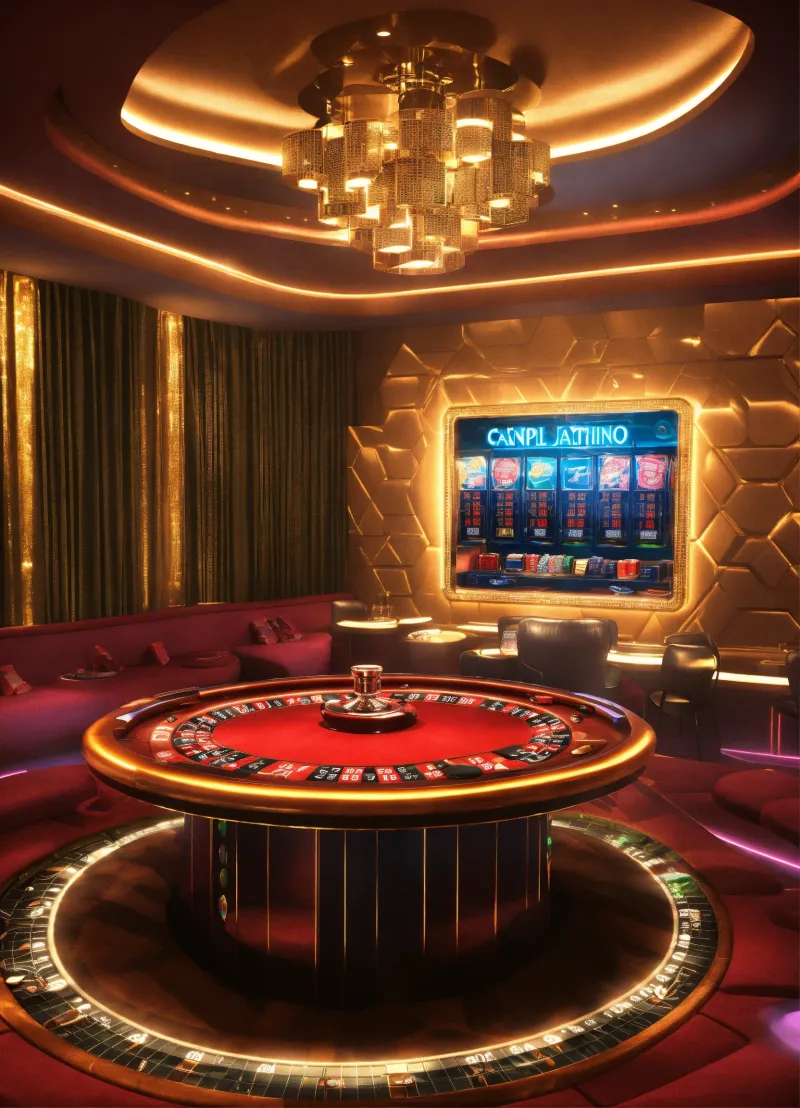
Let's start with the most obvious element: color. In the world of casino design, every hue carries emotional weight. Deep greens and rich golds are classic for a reason — they evoke prestige, calm focus, and the timeless glamour of a Vegas card room. Blues tend to build trust and promote relaxed decision-making, which is why you'll see them used heavily in platforms that want players to feel secure.
Red is a different story. It spikes energy and urgency, which is why it often shows up on call-to-action buttons or jackpot notifications. But overuse can lead to anxiety and impulsive choices — not exactly the vibe a quality platform wants to cultivate.
According to research in environmental psychology, color environments that align with a user's emotional expectations tend to produce longer, more satisfying engagement. In plain English? When a casino looks the way you expect a premium experience to look, you settle in and play better. You're not fighting the interface — you're flowing with it.
Layout Design and the Art of the Invisible Guide
Beyond color, the spatial arrangement of a casino's interface quietly steers your behavior every moment you're on the platform. Good layout design is almost invisible — you don't notice it because it's working exactly as intended.
Think about how slot games are organized on a well-designed platform. Popular titles appear front and center, categories are clearly labeled, and the path from browsing to playing is short and frictionless. That's not laziness — it's intentional architecture. Designers call it "cognitive load reduction," and the idea is simple: the less mental energy you spend navigating, the more you can spend enjoying.
Contrast that with cluttered, overwhelming interfaces that bombard you with pop-ups, flashing banners, and a dozen competing CTAs. Studies on decision fatigue show that when users face too many choices without clear hierarchy, they make worse decisions — or simply leave. A clean, well-structured layout doesn't just look nicer; it actually supports better, more deliberate play.
Typography and Trust: The Details You Don't Notice
Here's something most players never think about: the fonts a casino uses affect how much you trust it. Serif typefaces — think the kind you'd see in a high-end magazine — communicate heritage, stability, and authority. Clean sans-serifs feel modern and approachable. Decorative or overly stylized fonts, on the other hand, can unconsciously signal that a platform is trying too hard, or worse, that it's not quite legitimate.
For US players especially, trust is everything. You're handing over real money and personal information, and your brain is scanning every visual cue to decide whether this platform deserves it. A polished, cohesive typographic system signals that the people behind the platform care about the details — and if they care about the details of design, they probably care about the details of security and fairness, too.
Aesthetics and Responsible Gaming: A Surprising Connection
Here's where it gets really interesting. There's a growing body of research suggesting that thoughtful, elegant design can actually support more responsible gaming habits.
When a platform is visually chaotic — aggressive animations, urgent red alerts, relentless notifications — it creates a state of low-grade stress that can push players toward reactive, impulsive behavior. The "just one more spin" mentality is partly an emotional response to environmental stimulation.
Calm, well-organized design does the opposite. It gives players space to think, to check in with themselves, and to make deliberate choices. Features like clear session timers, easy-to-find account settings, and uncluttered betting interfaces aren't just UX niceties — they're tools that help players stay in control.
Dr. Mark Griffiths, a behavioral addiction researcher at Nottingham Trent University, has noted that the structural characteristics of gambling environments — including visual and auditory design — have significant influence over play patterns. Platforms that prioritize elegant, intentional design over sensory overload tend to attract players who engage more thoughtfully and sustainably.
Pretty Design Is a Competitive Advantage — And a Player Benefit
So why does any of this matter to you as a player? Because understanding the psychology of design helps you recognize what a quality platform looks like before you even place a bet.
When you land on a site that's visually cohesive, easy to navigate, and aesthetically considered — like what we aim to deliver here at Pretty Casino — that's a signal. It means the platform was built with intention, not just cobbled together to grab your attention and your deposit.
Good design respects your intelligence. It doesn't try to trick you with dark patterns or overwhelm you into acting before you're ready. Instead, it creates an environment where you can focus on the game, enjoy the experience, and make the choices that are right for you.
And honestly? Playing on a beautiful platform just feels better. There's a reason people drive nicer cars and eat at well-decorated restaurants even when the functional alternative would do. Aesthetics enhance experience — and in online gaming, that enhanced experience translates directly to more enjoyment per session.
What to Look For in a Well-Designed Casino Platform
Next time you're evaluating an online casino, run a quick visual audit:
- Color palette: Is it cohesive and calming, or chaotic and aggressive?
- Navigation: Can you find what you're looking for in three clicks or fewer?
- Typography: Does the text feel professional and easy to read?
- Animation: Are motion elements purposeful, or just noise?
- Responsible gaming tools: Are they easy to find, or buried in a sub-menu?
These aren't just aesthetic preferences — they're indicators of how much a platform values your experience. And at the end of the day, that's the kind of platform worth your time and your wager.
Pretty isn't just a name. It's a standard.