Pretty by Design: The Hidden Psychology Behind Every Button, Color, and Click in Your Favorite Casino Games
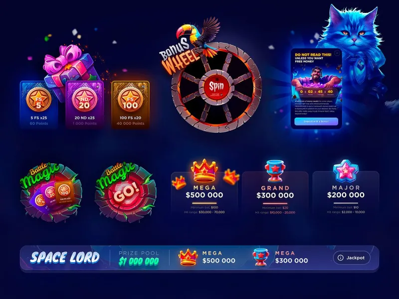
Photo: colorful online casino game interface with glowing buttons and neon lights on screen, via i.pinimg.com
There's a reason your favorite online casino feels so effortless to navigate. Everything loads fast, the colors pop just right, and somehow you always know exactly where to click next. That's not an accident — and it's definitely not just good taste. It's intention, dressed up in a very attractive package.
Modern casino interfaces are built at the intersection of behavioral psychology, graphic design, and data science. The people who design these platforms aren't just making things look pretty (though they absolutely are doing that). They're making decisions that directly influence how you play, how long you stay, and how much you bet. Knowing the difference between beautiful design and behavioral nudging might be the most underrated skill a US online casino player can develop.
Visual Hierarchy: Who's Really Running the Show?
Visual hierarchy is the principle that your eye naturally travels toward certain elements first — bigger items, brighter colors, things placed in specific spots on a screen. Web designers use this constantly, and casino platforms have mastered it.
Take a typical slot game interface. The 'Spin' button is almost always the largest, most visually prominent element on screen. On many platforms, it's centered, slightly raised, and saturated with a color that contrasts sharply with the background — usually gold, red, or neon green. Your eye goes straight to it. That's not coincidence; that's hierarchy at work.
Now look for the 'Min Bet' option. It's usually smaller, tucked into a corner, rendered in a muted tone. The visual weight of the interface is silently making an argument: this button matters more than that one. Whether you consciously register it or not, that argument lands.
The same logic applies to table games. On digital blackjack and roulette layouts, chip denominations are often displayed in a way that makes mid-to-high-value chips the easiest to tap. It takes a deliberate, extra step to dial things down. Friction is a design choice — and platforms use it strategically.
Typography That Talks You Into Things
Font choices in casino games aren't arbitrary. Thick, bold numerals make bet amounts feel weighty and significant — not in a cautionary way, but in a this is exciting way. When your current jackpot amount is displayed in a large, animated font with a warm glow effect, it stops being just a number. It becomes a destination.
Contrast that with the way terms, conditions, or payout tables are often displayed: smaller type, lighter weight, sometimes tucked behind a secondary menu. The information is there — it's just not inviting you to read it the way the jackpot counter is inviting you to chase it.
For US players especially, this matters. American casino culture has always had a theatrical element to it — Vegas showmanship, Atlantic City flash. Online platforms have translated that energy into typography and layout, and they've gotten very good at it. The font is part of the performance.
The Dopamine Design: Winning Notifications and Why They Feel So Good
Here's where things get genuinely fascinating. When you land a winning combination — even a small one — the modern casino interface goes to work immediately. Colors shift. Animations fire. Sound effects layer in. Numbers climb. Everything on screen is telling you: something great just happened.
This cascade of sensory feedback isn't just celebration — it's reinforcement. Behavioral science has long established that variable reward systems (where wins are unpredictable in timing and size) are among the most psychologically compelling patterns a human brain can experience. The flashing lights and climbing coin counters are the visual language of that reward system.
Color plays a specific role here. Gold and bright yellow are almost universally used for winning states — and for good reason. These colors signal warmth, reward, and value across cultures. Red, meanwhile, does double duty: it signals urgency in some UI contexts (like limited-time bonuses) and excitement in others (big win alerts). Green carries associations with money and go-signals. Casino designers know this playbook cold.
Button Placement and the Architecture of a Bigger Bet
One of the more subtle design moves in online casino UI is what's sometimes called progressive commitment architecture — the way interfaces guide players toward gradually increasing their stakes without any single moment feeling like a dramatic leap.
It works like this: after a winning round, many platforms surface an auto-populated 'Increase Bet' prompt or highlight the next chip denomination up. After a loss, some interfaces subtly emphasize a 'Double Down' or 'Bet Again' option. The sequence feels natural because it's designed to. You're being walked up a staircase one comfortable step at a time.
This doesn't mean you're being manipulated into anything you can't control — but it does mean that not increasing your bet requires a conscious, deliberate choice. The default path, the path of least resistance, often runs in the house's favor.
So Is Beautiful Design Ethical?
This is genuinely worth sitting with. There's a real argument that well-designed interfaces make games more enjoyable — they reduce confusion, minimize errors, and create an entertainment experience that's genuinely fun. Pretty Casino is built on the premise that style and substance aren't opposites. Looking good and playing well can absolutely coexist.
But there's a line between design that serves the player and design that serves the platform at the player's expense. Responsible gaming advocates in the US have increasingly pushed for clearer disclosure of RTP rates, more visible access to spending controls, and fewer dark patterns in casino UI. Some jurisdictions are beginning to regulate specific design choices — like auto-play features and turbo spin settings — precisely because of their behavioral impact.
The savvy move isn't to distrust beautiful design. It's to appreciate it and stay conscious of what it's doing. Notice when you're being guided toward a larger bet. Recognize the emotional high of a winning animation for what it is. Set your limits before you open the game, not in the middle of a hot streak.
Playing Pretty — On Your Own Terms
There's something genuinely enjoyable about a well-crafted casino interface. The visual richness, the smooth animations, the satisfying click of a well-placed chip — these things are part of why online gaming has exploded in the US market. You don't have to strip away the fun to play smart.
But the most stylish move at any table, virtual or otherwise, is knowing the rules of the game — including the ones nobody puts in the tutorial. When you understand that the interface is a participant in your session, not just a backdrop, you play differently. More deliberately. More confidently.
And honestly? That's a pretty good look.